Avoidance Loops: Why You Delay What You Care About
In short: Avoidance is often described like a personal flaw: procrastination, inconsistency, “lack of discipline.” But in real nervous systems, avoidance is frequently a stabilizing move—a way to reduce load when something feels too open-ended, too evaluative, or too costly to start. Many apps unintentionally amplify that loop.
Avoidance is often described like a personal flaw: procrastination, inconsistency, “lack of discipline.” But in real nervous systems, avoidance is frequently a stabilizing move—a way to reduce load when something feels too open-ended, too evaluative, or too costly to start.
Many apps unintentionally amplify that loop. They ask for motivation, offer streak pressure, and measure progress by taps. Meanwhile the user’s underlying experience stays the same: unfinished tasks that keep humming in the background, and a system that quietly learns that disengaging is the fastest route to relief.
What if an app could support completion instead of pressure?
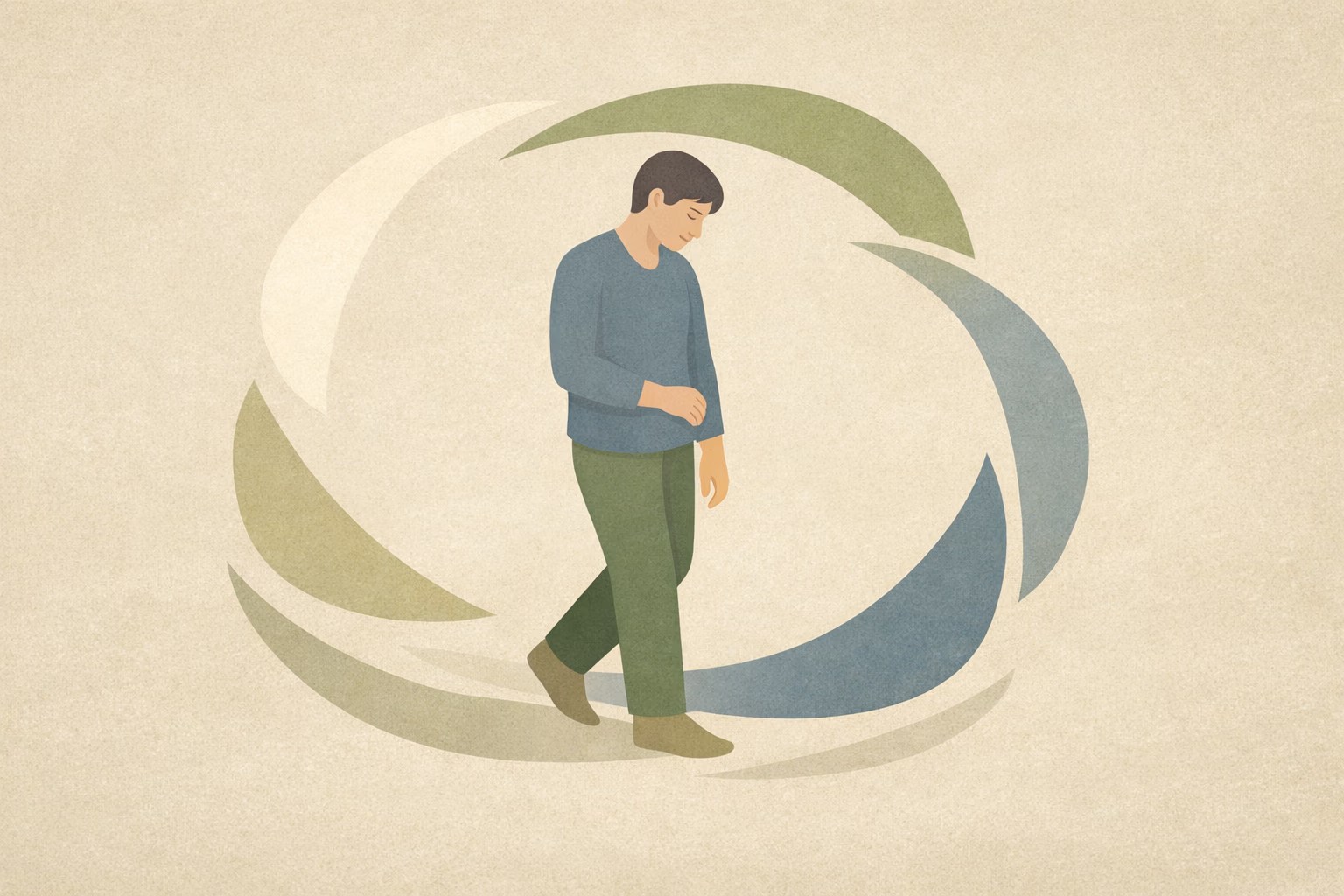
In an avoidance loop, the challenge isn’t necessarily the task itself—it’s the state that the task evokes: a sense of exposure, evaluation, or uncertainty. The nervous system reads that open loop as ongoing demand, and the quickest way to reduce demand is to move away from it.
That move away can look deceptively ordinary: closing the app, tidying the home screen, saving something “for later,” doing a small productive substitute, or repeatedly re-starting a plan. The user isn’t choosing chaos; they’re choosing a momentary “stand down” signal.
In digital wellness tools, this often shows up as a pattern of initial enthusiasm followed by quiet drop-off—especially when the app depends on self-initiation without providing a clear, survivable pathway through the hard middle. In studies of app-guided exposure approaches, the difference is often not information, but structured follow-through and prompts that help people stay with the process long enough for the loop to complete. [Ref-1]
When avoidance is a regulatory response, design that simply “reminds” can backfire. A reminder can become another demand signal, especially if it points to something the user already experiences as unresolved.
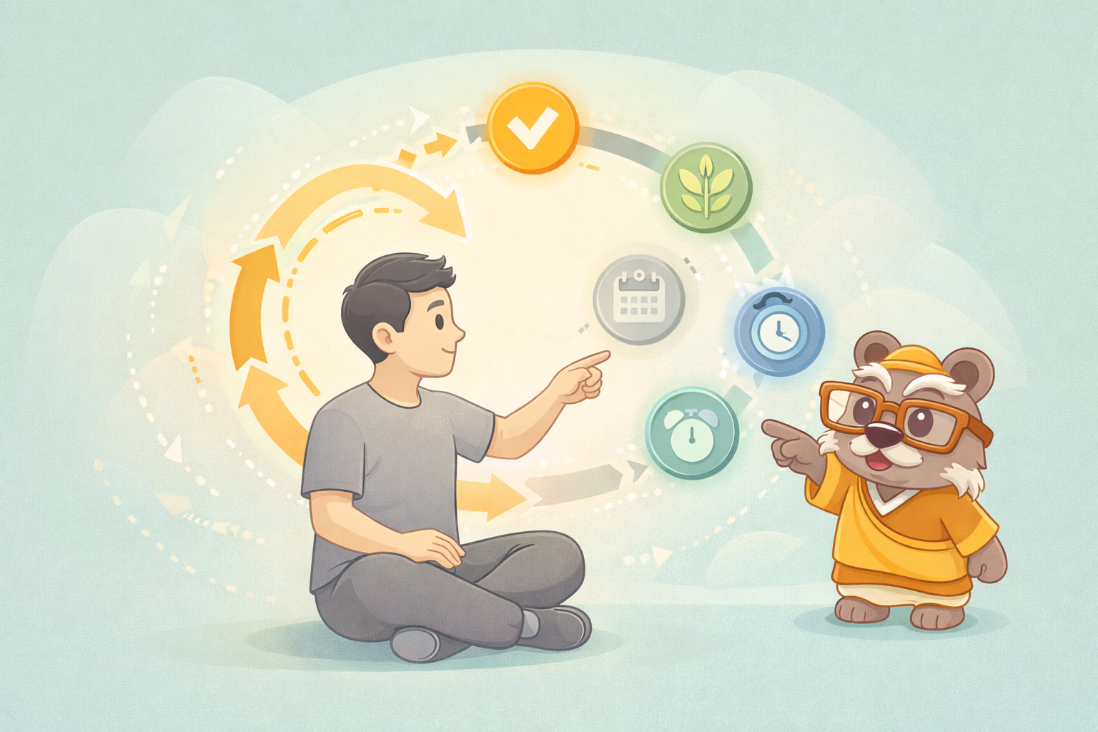
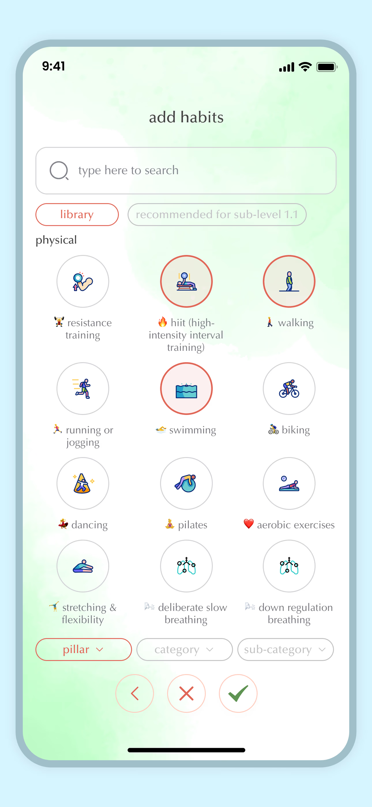
Avoidance-aware UX uses cues differently: not as pressure, but as scaffolding that narrows the next step until it is cognitively and physiologically doable. Micro-challenges, progressive pathways, and immediate feedback can help executive attention locate a specific target rather than a vague cloud of obligation. Digital graded-exposure approaches in VR and app formats show that repeated, structured steps—rather than one big leap—can reduce avoidance over time. [Ref-2]
Human attention is built to prioritize risk. Historically, disengaging from uncertain or high-cost situations often preserved energy and safety. Avoidance, in that sense, is not a glitch—it’s an ancient protective bias.
In modern contexts, the “threat” is often not physical. It can be social evaluation, performance pressure, identity stakes, or the vague sense that a task could spiral into more than one can complete. When the mind can’t predict a clean ending, it may choose a fast exit.
Digital systems can either respect this sensitivity or exploit it. Exposure-like design approaches—including geolocated, stepwise tasks with real-time feedback—show a different route: they reduce uncertainty by making the next step concrete and time-bounded, which changes what the nervous system expects from the interaction. [Ref-3]
One reason avoidance persists is that the initial entry cost is high: uncertainty, anticipation, and a sense of being “on the hook.” Avoidance-aware UX lowers that cost by creating safety cues—signals that the user can approach, learn, and exit in a controlled way, without being overwhelmed or trapped.
This is not about pushing people into discomfort. It’s about making the interaction predictable enough that the nervous system doesn’t need to protect itself through disengagement. Structured exposure models supported through technology often use graded steps, reminders, and between-session supports to reduce avoidance and increase follow-through. [Ref-4]
The goal is not intensity. The goal is a clean, survivable loop that can actually finish.
Digital products often treat engagement metrics as proof of progress: daily opens, time-on-screen, streaks, completion rates. But these can be compatible with avoidance. A person can tap, scroll, log, and still never cross the threshold of the thing they are organizing their life around not doing.
Avoidance is especially easy to miss when the interface rewards interaction that stays safely abstract—reading, tracking, planning, collecting tips—without requiring a lived encounter that can resolve the underlying open loop.
Design research from exposure-oriented tools highlights the practical difference between “using the app” and “moving through a graded challenge.” The second is where learning and closure become possible; the first can remain a polished holding pattern. [Ref-5]
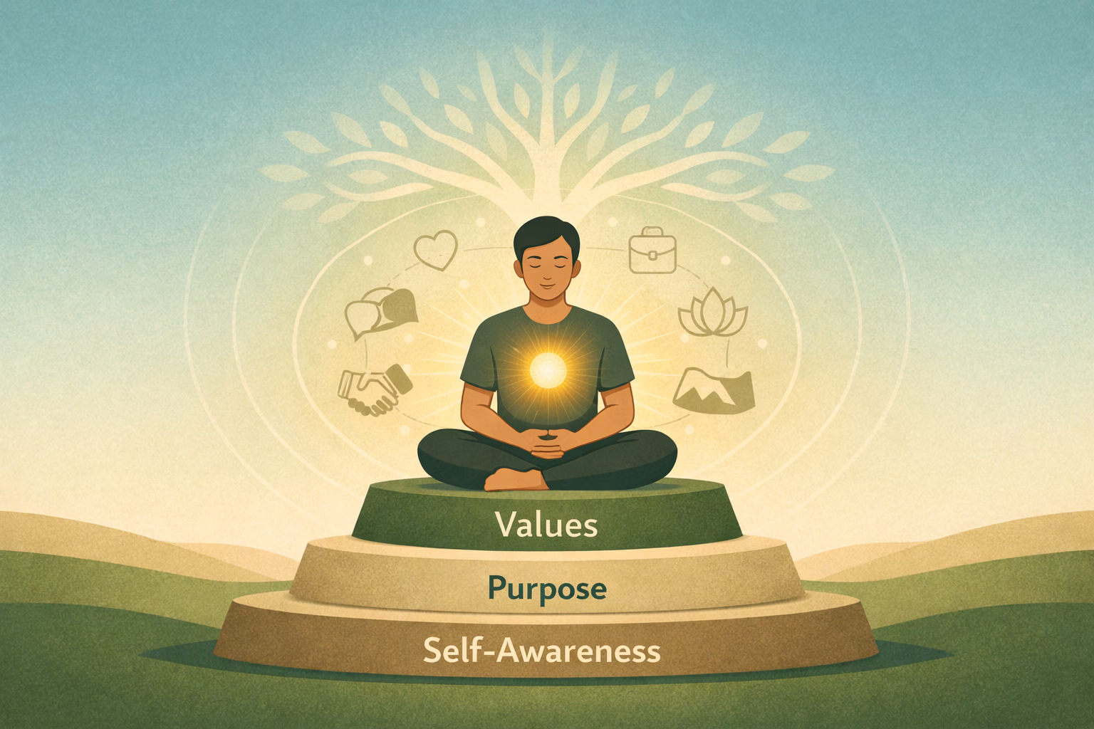
Breaking avoidance loops is not only about reducing discomfort; it’s about restoring coherence. People stabilize when their actions create a believable story about who they are—one that is confirmed by completed experiences, not by promises or self-talk.
A Meaning Loop in UX terms is a sequence that helps the user: (1) approach a manageable edge, (2) complete a small loop, and (3) register what that completion means for their life. Importantly, this isn’t “insight” as an endpoint. Insight is a moment. Integration is when the system stands down because the experience has actually finished and updated what feels possible.
Digital behavior change design work increasingly emphasizes graded tasks, adaptive goals, and timing of cues that support action rather than passive monitoring. [Ref-6]
What does the app help the user finish?
Because avoidance can hide inside high engagement, the more meaningful signals are often qualitative: does the user’s life show more completion, more follow-through, and less “background hum” from unfinished loops?
Autonomy-supportive approaches in digital behavior change emphasize competence, relatedness, and self-direction—markers that tend to show up when users feel capable and oriented, not when they feel managed. [Ref-7]
When an app rewards surface interaction, it can become a relief device: a place to feel like progress happened without paying the cost of confronting the unresolved. The user gets stimulation, reassurance, or a sense of organization—yet the open loop remains open.
This is not manipulation in every case; it’s often a mismatch between what the product measures and what the nervous system needs. A streak can create more evaluation. A dashboard can expand the task into a management job. A motivational feed can add noise to an already overloaded system.
Umbrella reviews of digital behavior change techniques often point toward structured elements—graded tasks, feedback, problem-solving supports—rather than generic rewards for app use. [Ref-8]
Feedback is not just information; it is a biological event. When feedback confirms “this is done,” the system can reduce activation. When feedback only says “more is expected,” activation continues—even if the user complied.
Progressive challenges can work as a bridge between avoidance and agency when they create a reliable ladder: the next rung is visible, bounded, and achievable. Accountability cues can help when they function as orientation (“this matters to me and to someone else”) rather than surveillance (“I’m being watched”).
Research on engagement problems in digital mental health repeatedly notes that logins and clicks do not equal deep engagement; what matters is whether the design supports sustained, meaningful participation that changes what users can do in real contexts. [Ref-9]
Completion changes behavior more than intensity does—because completion teaches the body it can return to baseline.
When someone repeatedly approaches a manageable edge and experiences a clean ending, something subtle can shift: decision-making becomes less expensive. Not because the person has more “motivation,” but because the nervous system expects less chaos from initiation.
Over time, well-designed exposure-like sequences can support steadier executive functioning: less start-stop, less bargaining, less reliance on last-minute urgency. Regulation improves when demands become predictable and finishable, not when pressure increases.
Broad reviews in digital mental health emphasize that sustained benefit depends on designs that support meaningful use rather than superficial interaction. In this frame, “meaningful” is often synonymous with experiences that actually complete and update the user’s sense of capability. [Ref-10]
Social elements can reduce avoidance when they provide stable context: belonging, shared language, and gentle continuity. They can also increase load if they introduce comparison, vague encouragement, or pressure to perform wellness in public.
Community works best when it supports clarity: what the shared challenge is, what completion looks like, and how to return after a miss without stigma. Without scaffolding, peer spaces can become another place to lurk, consume, and postpone. Student experiences with digital mental health packages often highlight that shallow peer support isn’t enough; people need structure that translates support into real follow-through. [Ref-11]
Does the community reduce ambiguity—or add a new stage?
As avoidance loosens, the change is not always dramatic. Often it looks like reduced friction: fewer internal negotiations, faster re-entry after interruptions, and a calmer relationship with “not finished yet.” The user becomes less dependent on perfect conditions to begin.
Importantly, this isn’t merely feeling encouraged. It’s a structural shift: more experiences reach closure, and the system updates what it predicts about effort and outcome. That update creates a form of confidence that is less performative and more practical.
Work on engaging users in behavior change distinguishes between summative metrics and deeper engagement—emphasizing autonomy-supportive design that respects the user’s agency and context. [Ref-12]
The best outcome for an avoidance-aware app is not dependence. It’s a transition: the external structure helps the user complete enough loops that they can generate structure internally.
At that point, prompts matter less because the person has a felt sense of sequencing: what “small enough to start” means, what “done” feels like, and how to approach discomfort without escalating the whole system. Meaning becomes less about tracking and more about lived identity—because repeated completion has quietly built credibility.
Ethics discussions about direct-to-user digital mental health tools emphasize that technology should scaffold reflective decision-making rather than maximize engagement loops. In practice, this points toward designs that return agency to the user as their capacity strengthens. [Ref-13]
When an app is designed around avoidance, it stops asking the user to prove their worth through consistency. Instead, it treats inconsistency as information: a sign that the next step is too large, too vague, too evaluative, or too unfinishable under current load.
In that sense, avoidance-aware UX is a bridge from external scaffolding to self-directed coherence. The user doesn’t need to become a different kind of person; they need experiences that can complete, settle, and become part of who they already are.
Behavior change support systems research increasingly emphasizes tailoring, feedback, graded challenges, and social support as core principles. The deeper question underneath those principles is simple: does this product help a human nervous system reach closure? [Ref-14]
Effective wellness apps do more than track behavior. They reduce fragmentation by helping experiences reach completion—step by step—so the user’s system can stand down and their choices can feel coherent.
Data can be useful, but stability comes from integration: when what someone does repeatedly becomes believable as identity, not just recorded as activity. Designs that scaffold reflection without turning it into performance can help data become meaning, rather than noise. [Ref-15]
In a world that keeps life unfinished, an app that supports clean endings can be a quiet form of care.
From theory to practice — meaning forms when insight meets action.
Because they often amplify the loop instead of interrupting it. They ask for motivation, offer streak pressure, and measure progress by taps — meanwhile the user's underlying experience stays the same: unfinished tasks humming in the background. Reminders can become another demand signal, especially if they point to something already experienced as unresolved. A streak can create more evaluation. A dashboard can expand the task into a management job. Engagement metrics can be fully compatible with avoidance — the user can tap and log without ever crossing the threshold of the thing they're organizing their life around not doing.
It treats the next step as the unit of design, not the goal. Micro-challenges narrow ambiguity by making 'what counts' unmistakable. Timing and context cues reduce the effort of deciding when to begin. Feedback provides a real completion signal, not just a score. Progressive difficulty prevents early steps from being too costly to enter. The goal isn't intensity — it's a clean, survivable loop that can actually finish. Structured exposure-style designs reduce uncertainty by making each step concrete and time-bounded, which changes what the nervous system expects from the interaction.
By chaining three moves: (1) approach a manageable edge, (2) complete a small loop, and (3) register what that completion means for life. Insight is a moment; integration is when the system stands down because the experience finished and updated what feels possible. The deeper question for any wellness feature isn't 'does it engage users?' but 'does this product help a human nervous system reach closure?' Identity stabilizes when actions create a believable story confirmed by completed experiences — not by promises, streaks, or self-talk.
No — and that's the ethical hinge. The best outcome for an avoidance-aware app isn't dependence; it's transition. External structure helps the user complete enough loops that they can generate structure internally. At that point, prompts matter less because the person has a felt sense of sequencing: what 'small enough to start' means, what 'done' feels like. Technology should scaffold reflective decision-making, not maximize engagement loops. Designs that return agency as the user's capacity strengthens are doing the actual job.
From Science to Art.
Understanding explains what is happening. Art allows you to feel it—without fixing, judging, or naming. Pause here. Let the images work quietly. Sometimes meaning settles before words do.
One Quiet Window, one insight, one reflection — every Sunday